How to make the slider responsive for all devices? Or creating different sliders for mobile and desktop.
You have two Possibilities for Responsive Settings:
Step 1: Simple Linear Responsive:
In this case, the slider linear resize all layers, contents based on the browser size and original layer grid size.
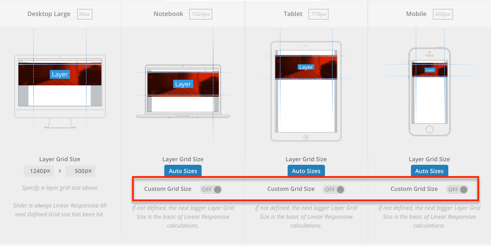
Step 2: Break Points Based Responsive:
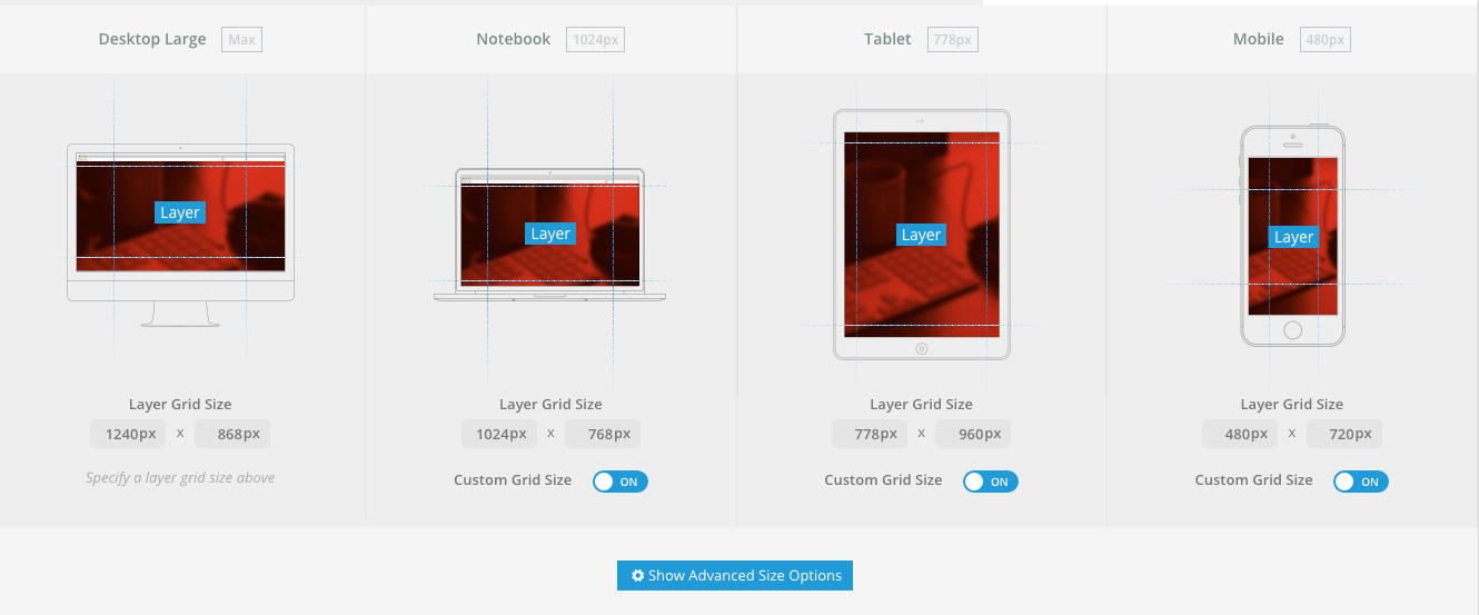
This will give you four breakpoints. Between the Breakpoints it resizes linear, but at new Breakpoints, you can define new positions, Styles, sizes to fit as good as possible the slider on any device.
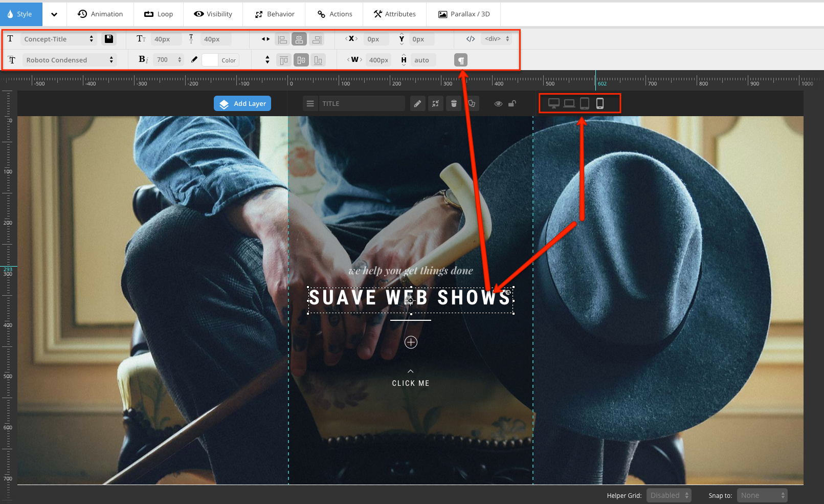
Step 3: In this case, you need to set the Layers per Device type as shown here:
Also, a video which explains everything perfectly for you: https://youtu.be/iyuxFo-WBiU
Step 4: Column Settings
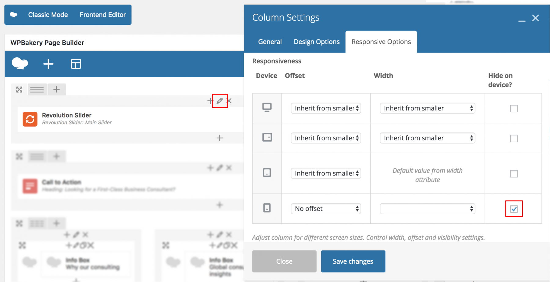
If both of ways don’t help, You can just a create a different new Slider for mobile phones and switch sliders for different devices via Visual Composer > Column Settings > Responsive options:

Leave A Comment?